![ANTIHERO [DEMO]](https://img.itch.zone/aW1nLzE5MzU2MDM5LnBuZw==/original/tdB8nC.png)
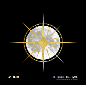
ANTIHERO [DEMO]
AN INTRODUCTION. ANTIHERO is an interactive story. Your choices influence not only the story's outcome, but your relationship with the characters and the world. Will you break the cycle and bring the villains justice or will you reclaim the world as your own? The decision, my friend, is all yours.
FEATURES. Your character is completely customizable. Your choices have meaning. Shape your relationship with the characters. Build the world or destroy it.
CHARACTERS (A BRIEF LIST). Raine Reckoning. Leif Underwood. Casper Greives. Ever Waymaker. Alec Requite. Aurelius Hart. Roscoe Throttle. Rhodes Rage.
A NOTE. ANTIHERO is a work in progress. I will update as frequently as possible.
A FINAL NOTE. Thank you so much for reading! If you have any suggestions, thoughts, comments, etc. feel free to let me know! I promise I will do the best I can to bring this story to life.
| Published | 2 days ago |
| Status | In development |
| Platforms | HTML5 |
| Rating | Rated 3.0 out of 5 stars (2 total ratings) |
| Author | lightning strikes twice |
| Genre | Interactive Fiction |
| Tags | Character Customization, Characters, Meaningful Choices, Romance, storygame, Story Rich, Superhero, Text based, Twine |

Comments
Log in with itch.io to leave a comment.
It's an interesting premise for sure but you need a better summary/introduction than "
Will you break the cycle and bring the villains justice or will you reclaim the world as your own? The decision, my friend, is all yours." but it would be a disservice to your writing later on because all it says is what the story is going to be about but does nothing to tell us WHY should we be invested in YOUR storytelling.
Overall, I'm looking forward to your storytelling but you really need a better summary/introduction. Brevity may be the soul of the wit but in this case it's not doing you favors.It would also be nice if there was an explanation for what attributes 1,2,3 are supposed to be for, and if you could increase the font size for this game's page it would be much appreciated because the font style is a bit hard to read for people with visual problems like me.